We have received our updated G7 Master Qualification certification. G7 Master Status indicates that Classic Litho + Design has calibrated our equipment and systems to G7 gray balance and neutral tone curves and is capable of delivering G7 proofs and print products.
 What does G7 Mean To You?
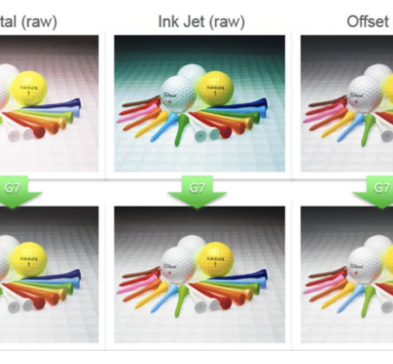
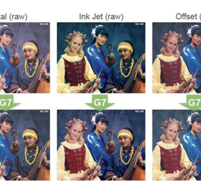
If all print products have the same gray balance and neutral tonality defined by G7, they will look remarkably alike to the human eye, a key component in effective brand quality management.
G7 aligns any printing device for one file, one calibration, one aim point.
Download White Paper: The Value of G7 for Brand Owners
Brands, Buyers & Creatives use qualified G7 suppliers such as Classic Litho + Design because…
Consistency
- Color is an important part of why people embrace (or reject) a brand
- Color greatly contributes to perceived value of quality
- Color and color quality enhance consumers’ experience with the product and add to its public reputation
- Color is one of the most emotional attributes of a brand
- Color consistency reinforces trust. Inconsistency with colors associated with a brand subconsciously diminishes it, and erodes brand loyalty
Efficiency
- Reduced design times, faster turnaround as design occurs internally rather than on press
- Reduced cost of proofing and shipping prior to print
- Reduced need for on-site press checks, travel, and other tasks based on visual approval methods
- Reduced waste and make ready time during press runs
- Higher consistency in reprints
Communication
- Data exchange for purchasing and print buyers to assess supply chain performance
- Clear expectations for supply chain partners regarding acceptable work
- Overall increase in consistency, efficiency and savings
Can We Provide A Quote?
We are excited to provide new quotes for any projects you have in the pipeline. Large Format, Brochures, Mailing & Fulfillment, Packaging? Let us know!


 What does G7 Mean To You?